Visualise pipelines
Kedro-Viz displays data and machine-learning pipelines in an informative way, emphasising the connections between datasets and nodes. It shows the structure of your Kedro pipeline. This exercise assumes that you have been following the Spaceflights tutorial.
Install Kedro-Viz
If you did not already install Kedro-Viz when you installed the tutorial project dependencies then you can do so now by running:
pip install kedro-viz
Visualise a whole pipeline
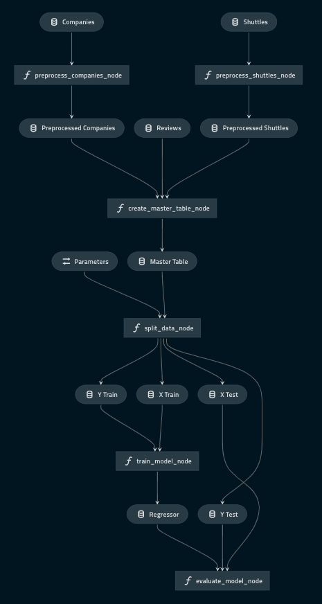
You should be in your project root directory, and once Kedro-Viz is installed you can visualise your pipeline by running:
kedro viz
This command will run a server on http://127.0.0.1:4141 that will open up your visualisation on a browser. You should be able to see the following:
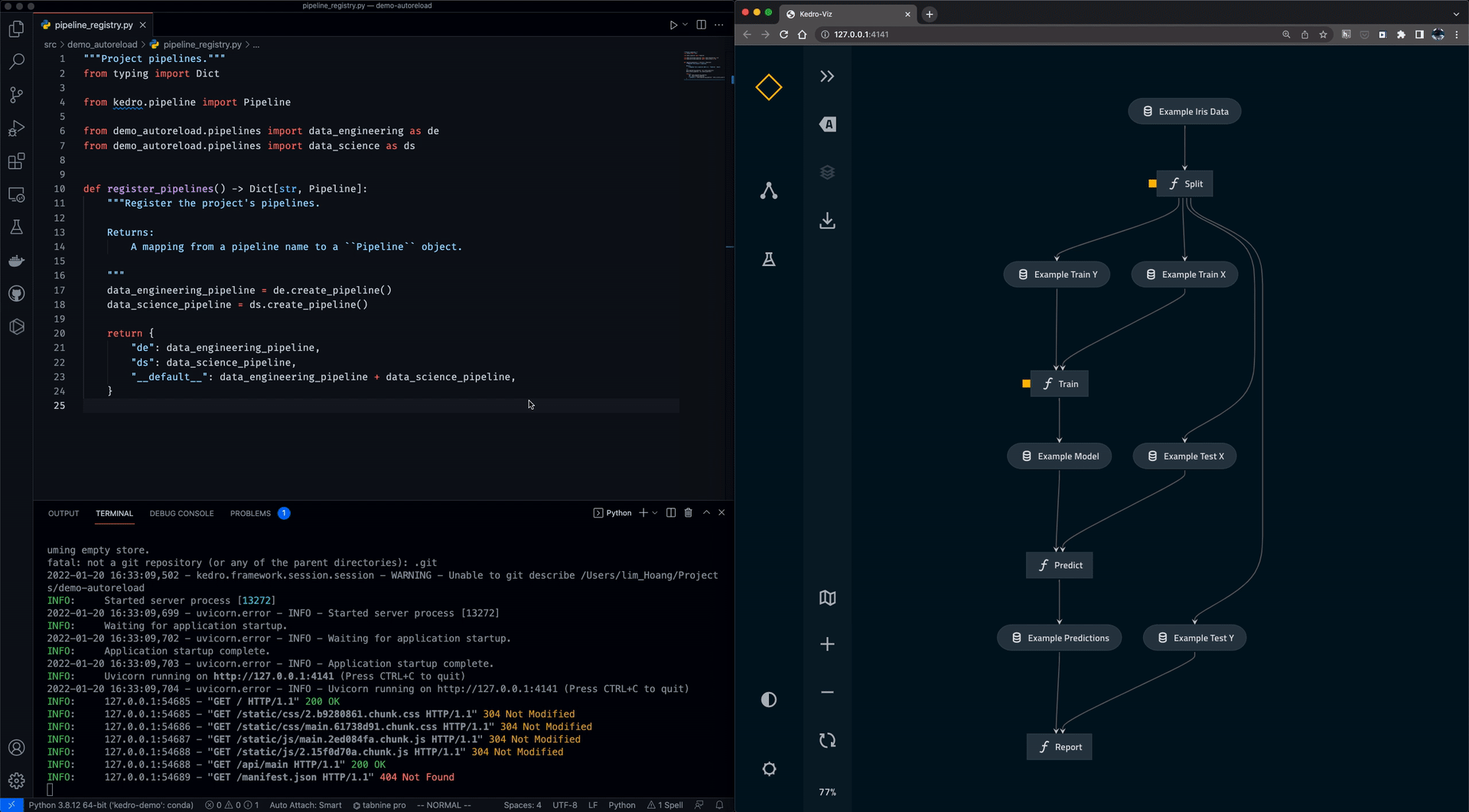
You may also use the --autoreload flag to autoreload Kedro Viz when a Python or YAML file has changed in the corresponding Kedro project.
If a visualisation panel opens up and a pipeline is not visible then please check that your pipeline definition is complete. All other errors can be logged as GitHub Issues on the Kedro-Viz repository.
Exit an open visualisation
You exit this visualisation by closing the open browser and entering Ctrl+C or Cmd+C in your terminal.
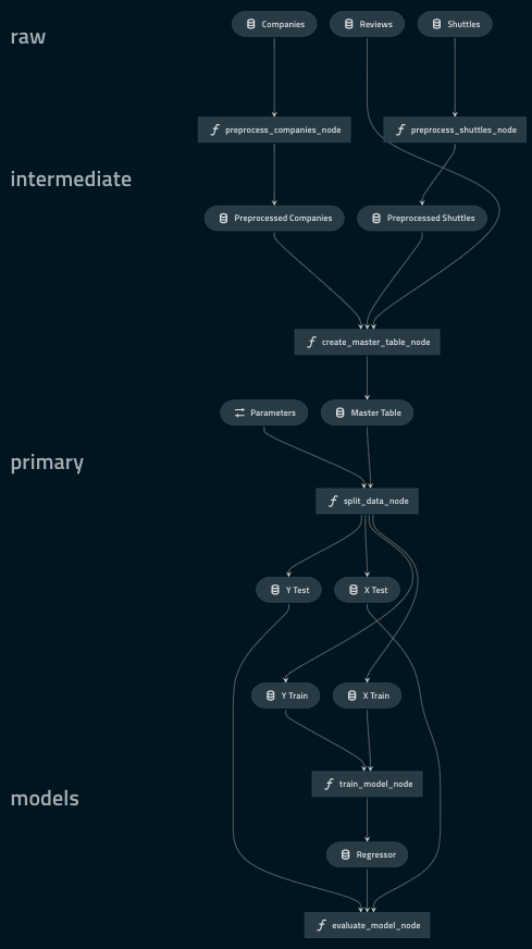
Visualise layers
A pipeline can be broken up into different layers according to how data is processed, and using a convention for layers makes it easier to collaborate. For example, the data engineering convention shown here labels datasets according to the stage of the pipeline (e.g. whether the data has been cleaned).
Kedro-Viz makes it easy to visualise these data processing stages by adding a layer attribute to the datasets in the Data Catalog. We will be modifying catalog.yml with the following:
companies:
  type: pandas.CSVDataSet
  filepath: data/01_raw/companies.csv
  layer: raw

reviews:
  type: pandas.CSVDataSet
  filepath: data/01_raw/reviews.csv
  layer: raw

shuttles:
  type: pandas.ExcelDataSet
  filepath: data/01_raw/shuttles.xlsx
  layer: raw

preprocessed_companies:
  type: pandas.CSVDataSet
  filepath: data/02_intermediate/preprocessed_companies.csv
  layer: intermediate

preprocessed_shuttles:
  type: pandas.CSVDataSet
  filepath: data/02_intermediate/preprocessed_shuttles.csv
  layer: intermediate

model_input_table:
  type: pandas.CSVDataSet
  filepath: data/03_primary/model_input_table.csv
  layer: primary

regressor:
  type: pickle.PickleDataSet
  filepath: data/06_models/regressor.pickle
  versioned: true
  layer: models
Run kedro-viz again with kedro viz and observe how your visualisation has changed to indicate the layers:
Visualise Plotly charts in Kedro-Viz
Plotly is a free and open source Python library that allows you to make interactive, publication-quality graphs. With the Plotly integration on Kedro-Viz, you can output your interactive charts as part of your pipeline visualisation.
Kedro-Viz aims to help users communicate different aspects of their workflow through an interactive flowchart. With the Plotly integration, we take one step further in this direction to allow our users to effectively share their data insights while exploring the pipeline.
We have also used the Plotly integration to allow users to visualise metrics from experiments.
Note
Kedro’s Plotly integration only supports Plotly Express <https://plotly.com/python/plotly-express/> charts.
You need to update requirements.txt in your Kedro project and add the following datasets to enable plotly for your project.
kedro[plotly.PlotlyDataSet, plotly.JSONDataSet]==0.17.7
You can view Plotly charts in Kedro-Viz when you use Kedro’s plotly datasets.
There are two types of plotly datasets in Kedro :
plotly.PlotlyDataSet - To use this dataset you need to configure your plot in the
catalog.yml.
Below is an example of how to visualise plots on Kedro-Viz using plotly.PlotlyDataSet
The below functions can be added to the nodes.py and pipeline.py files respectively.
def compare_shuttle_speed():
    return pd.DataFrame([])


def create_pipeline(**kwargs) -> Pipeline:
    """This is a simple pipeline which generates a plot"""
    return pipeline(
        [
            node(
                func=compare_shuttle_speed,
                inputs="shuttle_speed_data",
                outputs="shuttle_speed_comparison_plot",
            ),
        ]
    )
You need to then configure the plot in catalog.yml
shuttle_speed_comparison_plot:
  type: plotly.PlotlyDataSet
  filepath: data/08_reporting/shuttle_speed_comparison_plot.json
  plotly_args:
    type: bar
    fig:
      x: shuttle_name
      y: shuttle_speed
      orientation: h
    layout:
      xaxis_title: Shuttles
      yaxis_title: Shuttle Speed (km/hr)
      title: Shuttle Speed Comaprison
plotly.JSONDataSet - To use this dataset you need to configure your plot using plotly-express python library in your kedro node.
Below is an example of how to visualise plots on Kedro-Viz using plotly.JSONDataSet
The below functions can be added to the nodes.py and pipeline.py files respectively.
import plotly.express as px
from kedro.extras.datasets.plotly import JSONDataSet


def compare_shuttle_speed(shuttle_data):
    fig = px.bar(x=shuttle_data.name, y=shuttle_data.speed)
    return fig


def create_pipeline(**kwargs) -> Pipeline:
    """This is a simple pipeline which generates a plot"""
    return Pipeline(
        [
            node(
                func=compare_shuttle_speed,
                inputs="shuttle_speed_data",
                outputs="shuttle_speed_comparison_plot",
            ),
        ]
    )
For plotly.JSONDataSet, you will also need to specify the output type in catalog.yml like below.
shuttle_speed_comparison_plot:
  type: plotly.JSONDataSet
  filepath: data/08_reporting/shuttle_speed_comparison_plot.json
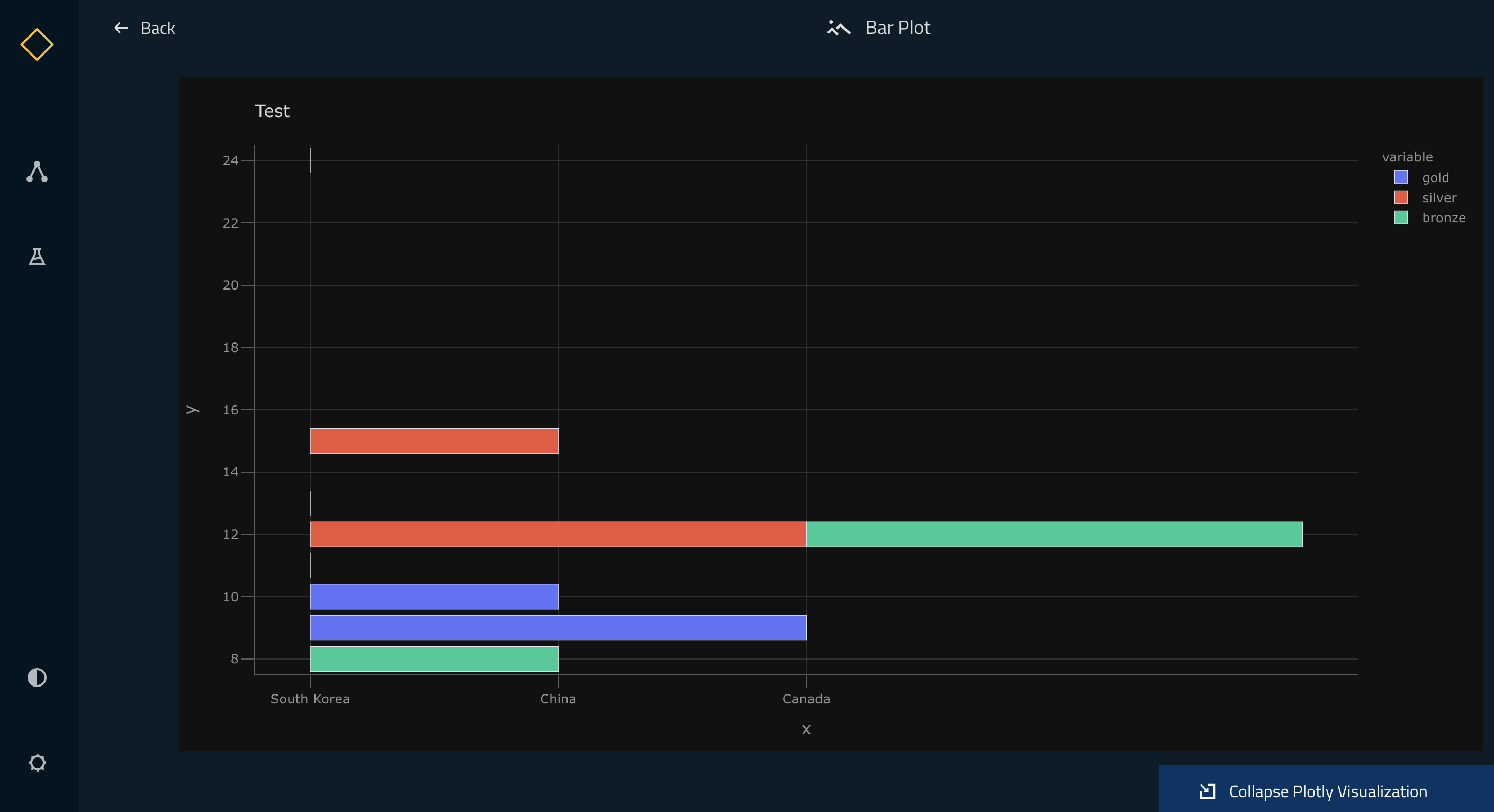
Once the above setup is completed, you can do a kedro run followed by kedro viz and your Kedro-Viz pipeline will show a new dataset type with icon ![]() . Once you click on the node, you can see a small preview of your Plotly chart in the metadata panel.
. Once you click on the node, you can see a small preview of your Plotly chart in the metadata panel.
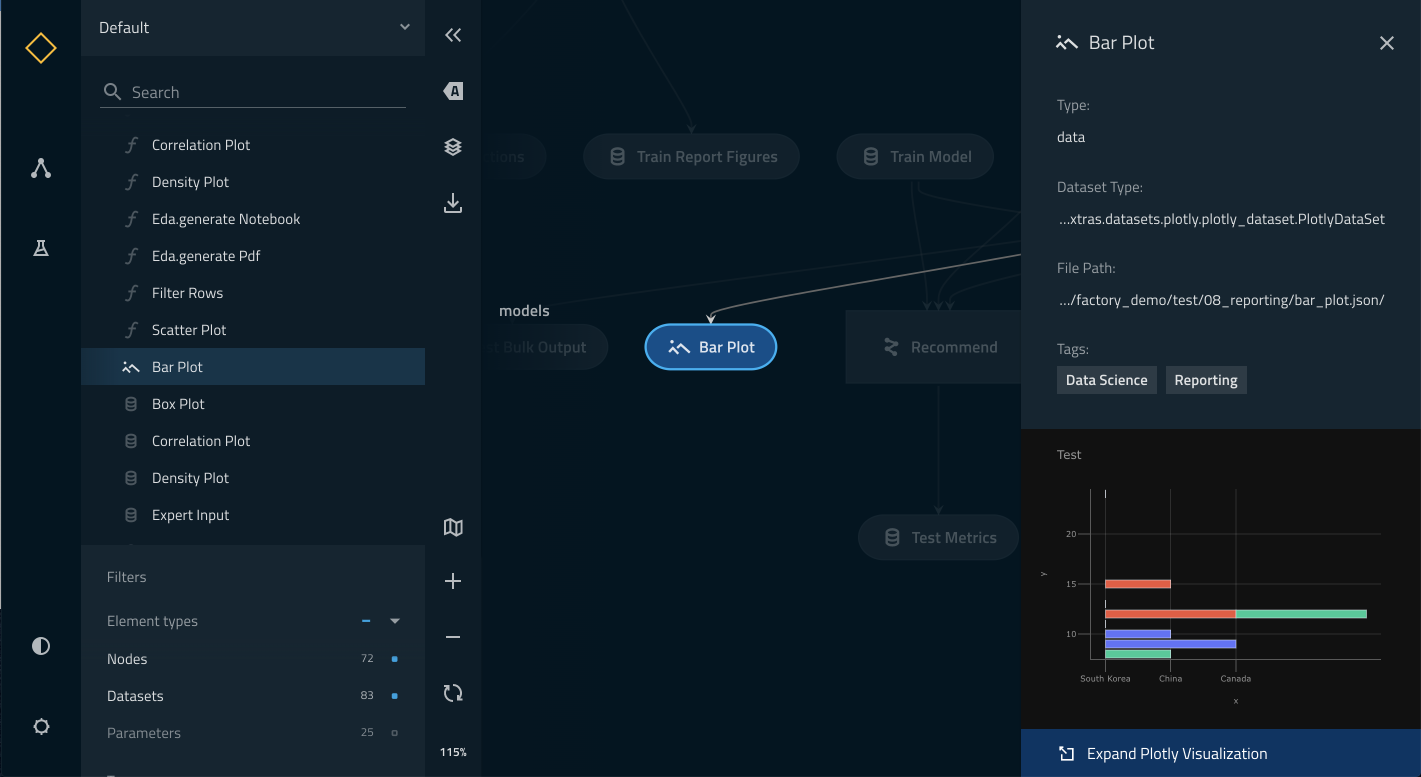
You can view the larger visualisation of the chart by clicking the ‘Expand Plotly Visualisation’ button on the bottom of the metadata panel.